Which IDX Chart Tool Shows Whether Volatility Is High for a Stock?
A PTBA walkthrough separates a high volatility state from a new expansion, checks the panel’s 100-bar table, and explains why historical percentages are not breakout odds.
By Trade Inc Research

Trade Inc’s Trading Chart can show whether an IDX stock is in a relatively high, medium or low volatility state and let you inspect the supporting display. In our PTBA daily-chart walkthrough, the panel showed high · stabil: a high-volatility state that the interface described as stable, not a new expansion.
That distinction matters when evaluating chart tools. A large trading range, a change in volatility and a rising price are different observations. This guide demonstrates the controls and how to read the result; it does not establish predictive accuracy.
Trade Inc publishes this article about its own product. The authenticated Pro-session screenshots were captured on 8 October 2026 around 10:00 WIB. They are intraday UI observations, not a verified end-of-day PTBA dataset or evidence of access on every plan.
Key takeaways
- Open the Volatilitas panel rather than treating its short badge as a complete explanation.
- “High” describes a relative volatility state; “stable” describes persistence in that state. They are not contradictory.
- Historical bar percentages are not probabilities of a future gain or breakout.
- Use separate evidence for price direction, liquidity and execution risk.
Open the stock, interval and volatility control
Go to Trading Chart. Click the ticker selector, search for PTBA, choose Bukit Asam, and confirm that the chart header changes to PTBA. Keep 1D selected for this walkthrough.
The Volatilitas button sits in the indicator row above the candles. Our clean chart view showed high · stabil. Click that button to inspect the details. The adjacent direction and strength badges answer different questions; the earlier trend-strength walkthrough explains that distinction.
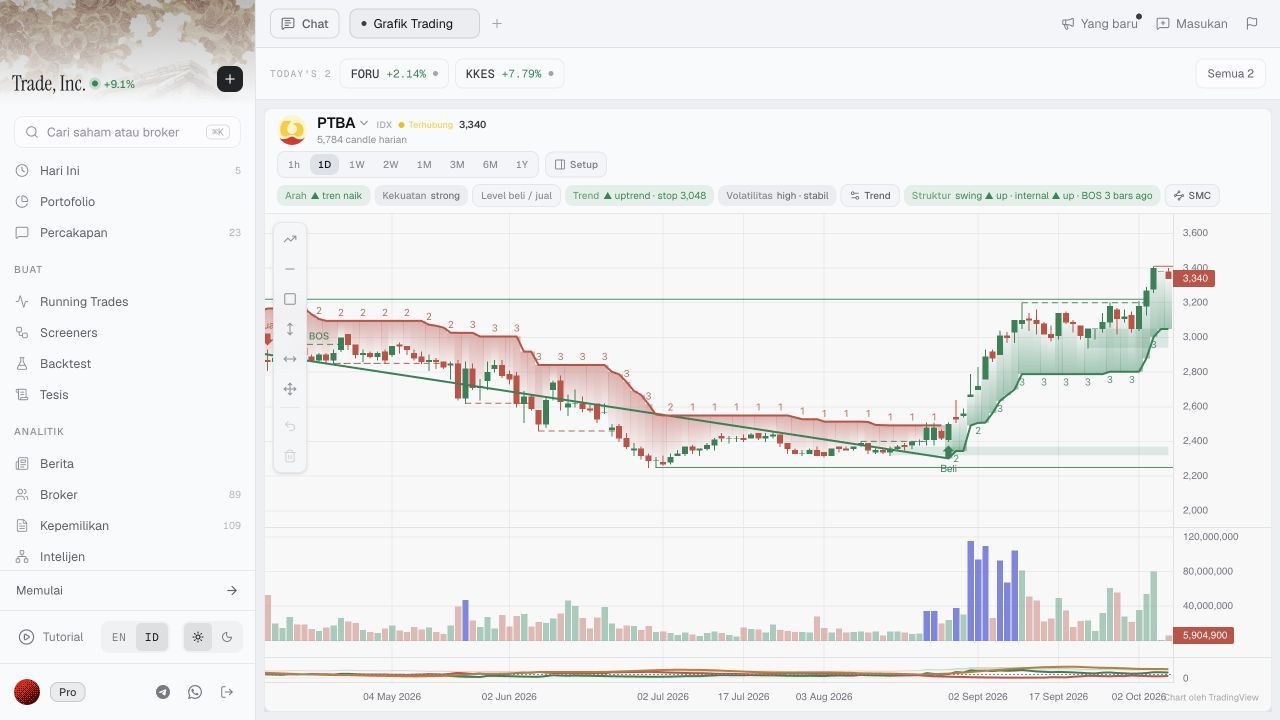
Step 1: PTBA selected, 1D active, and the volatility control visible. Other overlays and live quotes are incidental to this demonstration, not recommendations.
Inspect the result behind the badge
The panel showed a current ATR of approximately 106, a high-state run of 26 bars, and the following distribution over its displayed 100-bar window.
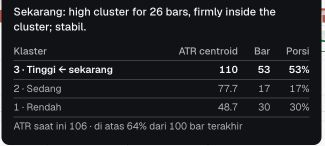
Step 2: a close-up of the actual result rows. This crop isolates the observed values; it does not reproduce the product’s calculation recipe.
| Displayed state | Bars | Share of the displayed window |
|---|---|---|
| High | 53 | 53% |
| Medium | 17 | 17% |
| Low | 30 | 30% |
| Total | 100 | 100% |
The simple consistency check is 53 + 17 + 30 = 100. The percentages match the counts because this window contains 100 bars. This verifies the table’s arithmetic—not the underlying classification.
The 26-bar current run is not the same denominator as the 53 high-state bars across the whole window. Other high-state bars may occur outside the current run. Neither number means “53% chance of winning” or “26 days until a reversal.”
The footer also said the current ATR was above 64% of the last 100 bars. That is a historical comparison displayed by the product, not a 64% probability of a future event. We did not independently reconstruct that rank or the ATR series.
What ATR adds—and what it cannot tell you
Average true range, or ATR, is a range-based volatility measure that accounts for price gaps. It does not supply price direction. Fidelity’s ATR guide explains both points.
For a separate hypothetical bar with a high of Rp3,400, a low of Rp3,300 and a previous close of Rp3,350, true range is Rp100. Change only the previous close to Rp3,200 and true range becomes Rp200 because the gap matters. These invented inputs illustrate the concept; they are not PTBA observations and do not reproduce its displayed ATR.
A single bar’s true range is not ATR, which combines ranges over a period. Nor does an ATR near Rp106 promise tomorrow’s range, a maximum loss or an executable stop price. A relative “high” label for one stock also does not establish that it is more volatile than another stock.
Check scope before relying on the label
This test verified that the chart selector, daily interval and volatility detail panel were available and returned the shown values. We did not audit the full input series, smoothing, corporate-action adjustments or label performance. The screenshots were taken while the market was open; the screen does not establish that every indicator included the latest live trade or a completed current-day bar.
Keep the ticker and interval fixed when recording a comparison. If the displayed state later changes, record the new observation and timestamp rather than treating this screenshot as a permanent assessment. Do not infer a breakout from a volatility label alone. No new Screener, historical strategy test or trade was created.
Who this workflow suits
The panel is useful if you already inspect individual IDX charts and want volatility context alongside the candles. If you only need a conventional ATR line, a charting tool you already use may be enough. This demonstration does not show a market-wide volatility scan or prove an advantage over another provider.
A practical acceptance test is to open your own ticker, verify the interval, inspect the supporting window, and explain the label without making a return forecast. Use manual date-and-price measurement for a chosen chart range; do not substitute that range for ATR or a future-risk estimate.
This article is for research and information only. It is not personalized financial advice or an instruction to trade.