Which IDX Chart Tool Can Measure a Selected Price and Date Range?
A KLBF walkthrough shows the drawing control, selected anchors and measured range—and why a displayed 6.76% move is not automatically a closing-price return.
By Trade Inc Research

Trade Inc’s Grafik Trading workspace includes a Date and price range drawing tool that measures a selected chart range. In our KLBF daily-chart demonstration, dragging between two manually chosen anchors produced a label of +50.5 (+6.76%), 45 bars and 64 days.
That does not mean an investor earned 6.76%, or that KLBF’s closing-price return over those dates was 6.76%. The measurement describes the selected coordinates. Inspecting those coordinates is the most important part of using the tool correctly.
This walkthrough was captured on 7 October 2026 in the authorised demo session previously identified as Pro. Trade Inc publishes this guide about its own product. Access on other plans and drawing persistence across sessions were not tested.
Key takeaways
- Select KLBF and 1D, then choose Date and price range from the drawing toolbar.
- Drag between the intended start and end points; inspect both anchors rather than trusting the percentage alone.
- Calendar days and chart bars are different measurements.
- A manually selected range is neither a closing-price return nor a backtest unless additional evidence establishes those definitions.
Step 1: choose the chart and measurement control
Open Grafik Trading, click the ticker heading, search KLBF, and choose Kalbe Farma. Set 1D for daily candles. The demonstrated screen displayed 5,519 daily candles loaded.
The vertical drawing toolbar contains separate Price range, Date range, and Date and price range controls. We selected the combined date-and-price tool before drawing.
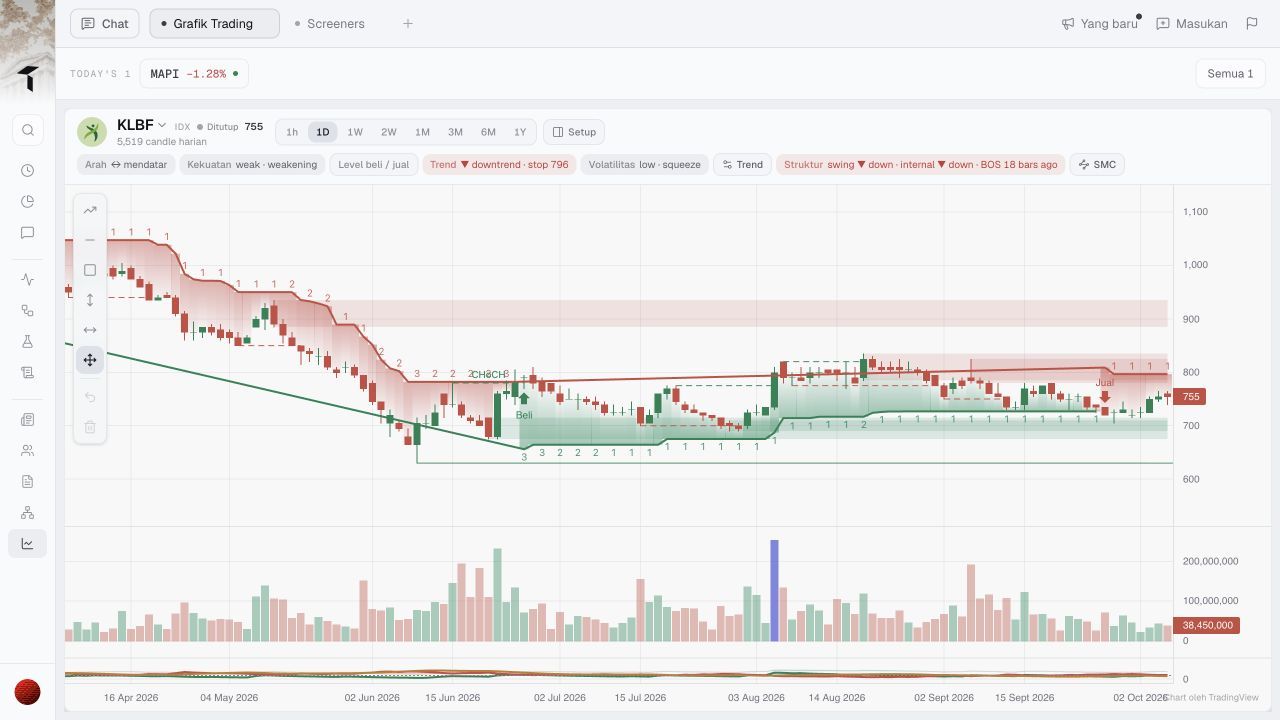
Before drawing: KLBF and 1D are selected; the combined measurement control is active.
As background, TradingView’s public documentation distinguishes vertical price measurements, horizontal time measurements and a combined tool. That source explains the general concept; the screenshots here establish what we actually observed in Trade Inc, not parity with every setting in another product. Date and price range drawing tools
Step 2: drag the range and read the result
We dragged from a point aligned with 15 June 2026 to a point aligned with 18 August 2026, with the second anchor higher on the price scale. The chart drew a shaded range and displayed its result.
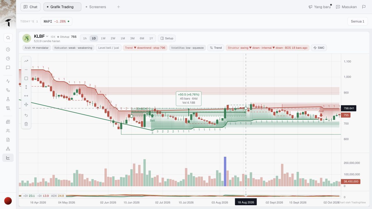
After dragging: the end-point crosshair shows 18 August 2026 and approximately 798.641 on the price scale. The label measures the selected drawing.
The display also includes a volume label. We did not independently reconcile that aggregate or its units, so this walkthrough does not use it to make a liquidity or accumulation claim.
Step 3: inspect the starting anchor
Clicking the starting anchor showed 15 June 2026 and approximately 748.093 on the price scale.
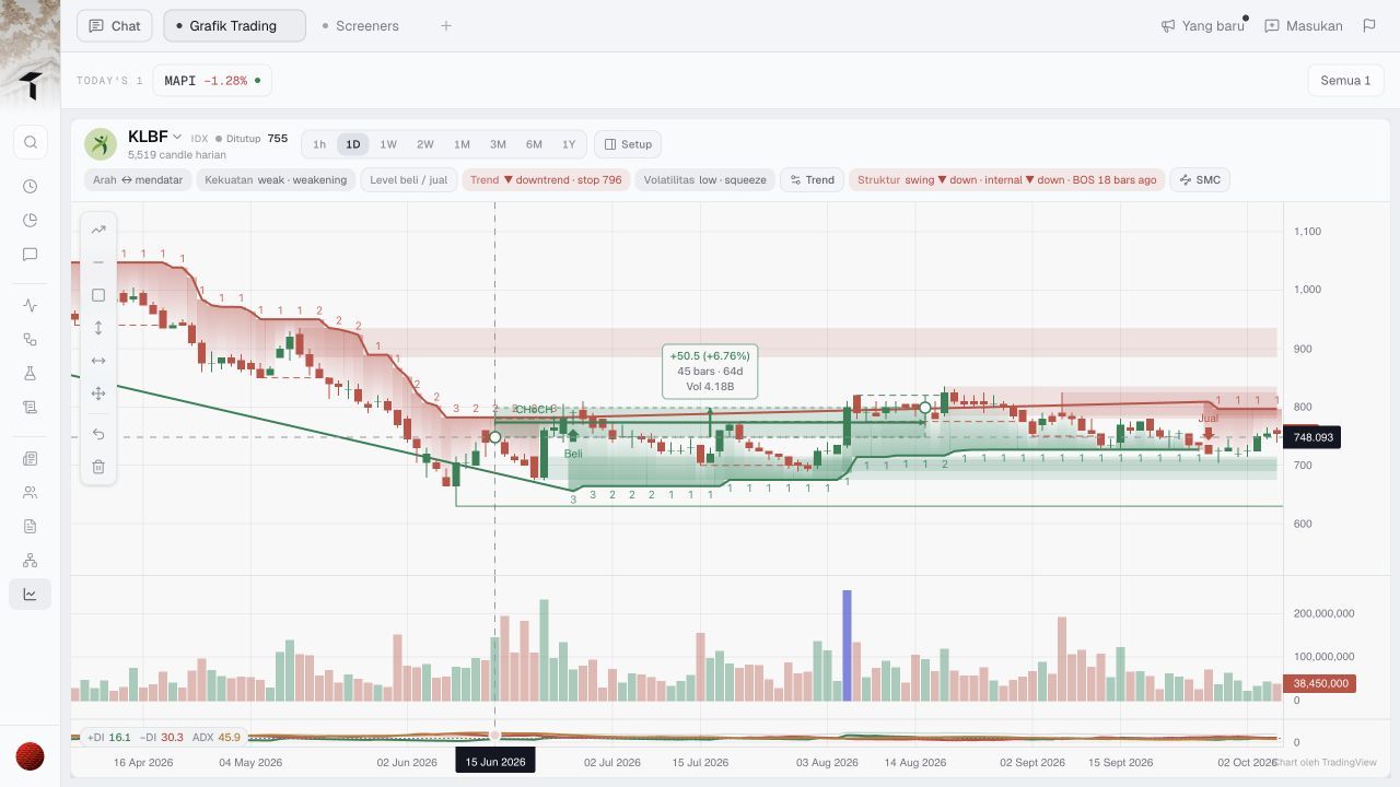
Endpoint check: the start coordinate is about 748.093, not an independently verified candle close.
The arithmetic is reproducible from the visible coordinates:
| Check | Calculation | Result |
|---|---|---|
| Selected price difference | 798.641 − 748.093 | 50.548, displayed as +50.5 |
| Selected percentage change | (798.641 ÷ 748.093 − 1) × 100 | About +6.76% |
| Calendar duration | 18 August minus 15 June 2026 | 64 days |
| Chart-bar count | Tool’s displayed label | 45 bars; not independently audited |
The decimal coordinates are a reason to pause. We placed the anchors manually and did not verify snapping to open, high, low or close. Calling this “KLBF returned 6.76%” would remove an essential qualification.
Match the measurement to the research question
For a visual question—“How large is the distance between these two chart points?”—the drawing answers directly.
For a performance question—“What was the closing-price return between these dates?”—first obtain the actual closing prices and establish the adjustment basis. Use the same price definition at both ends. Our guide to same-starting-basis stock comparisons covers a separate data-based workflow.
For a trading-result question, two anchors are insufficient. They do not establish executable fills, entry rules, costs, dividends, interim cash flows or what information was available at the time. Selecting an attractive historical range after seeing the chart is not evidence that a strategy could have captured it.
Likewise, 64 calendar days are not 64 trading sessions. The time axis and bar count answer different questions; neither should silently replace the other.
Who needs this—and where it stops
The tool fits investors preparing chart notes who need to show exactly which range they are discussing. It is less useful if you only need a numerical return from two known prices; a calculator or spreadsheet suffices.
This test verifies one desktop interaction, one ticker and one interval. It does not audit the underlying historical dataset, adjustments, bar-count convention, volume calculation or drawing persistence. Other overlays visible in the screenshots are not recommendations.
Keep the anchors with the percentage. If the intended question requires closing prices but the anchors are freehand, correct the measurement basis before drawing an investment conclusion. The feature’s value is making a selected range inspectable—not turning a rectangle into proof of performance.
This article is for research and information only. It is not personalized financial advice or an instruction to trade.