Which Tool Lets Me Compare Daily and Weekly IDX Charts in One Workspace?
A three-screen BBCA walkthrough shows where to click, how daily and weekly summaries differ, and which data limitations to check before interpreting the result.
By Trade Inc Research

Summary
Trade Inc’s Trading Chart lets you switch an IDX stock between daily and weekly candles in the same workspace. In our BBCA demonstration, changing from 1D to 1W changed both the displayed history and the chart’s direction and strength summaries. The useful question is not “which label wins?” but “which timeframe answers my research question?”
This walkthrough shows the actual entry screen, the daily view and the weekly result. It tests navigation and displayed output—not signal accuracy, executable prices or investment returns. Trade Inc publishes this guide about its own product. The public product page lists Trading chart under Pro; check current access before subscribing.
Key takeaways
- Start from the stock’s summary page and open the full Trading Chart. That was the entry route we successfully tested.
- A visible date range and a candle interval are different controls: seeing three months does not make each candle a three-month candle.
- Compare the same summary field across timeframes. Direction, trend and strength are not interchangeable labels.
- Check quote timestamps and whether the latest candle is complete before using a screenshot to support a decision. Our capture exposed a headline-price mismatch between two pages.
1. Find the chart from the stock page
Open BBCA’s stock page and locate the price panel in Ringkasan (Summary). Click Buka grafik trade →, at the upper right of that panel.
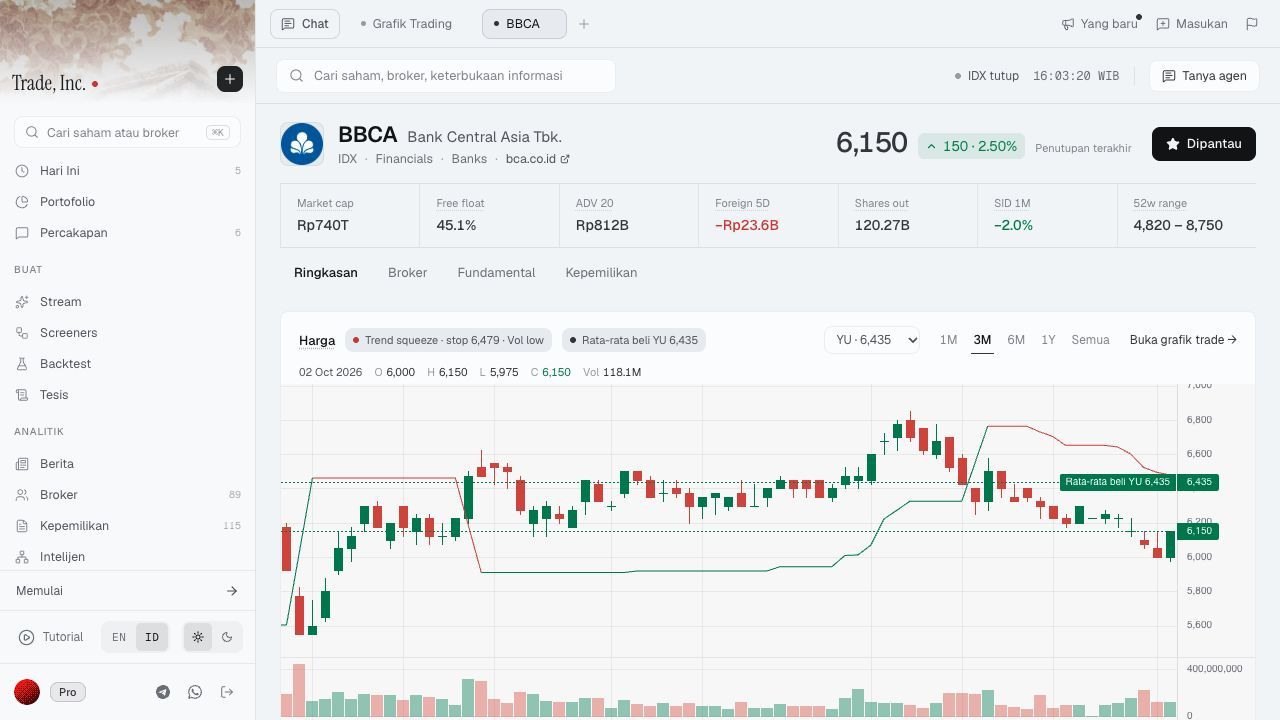
Step 1 — Click “Buka grafik trade →” above the price panel, near its upper-right corner. This actual demo screenshot was captured on 2 October 2026 at 16:03 WIB. The highlighted 3M control belongs to the summary’s displayed range, not the full chart’s daily/weekly interval.
This entry point matters because it carries the stock into the chart. During our check, the full chart’s ticker picker returned no match for BBCA. Opening the chart from BBCA’s summary page worked. That is the route demonstrated here, not a claim that every search route worked.
2. Establish a daily baseline
In the full chart’s upper toolbar, select 1D. Before interpreting an overlay, confirm the ticker is still BBCA and the daily interval is selected.
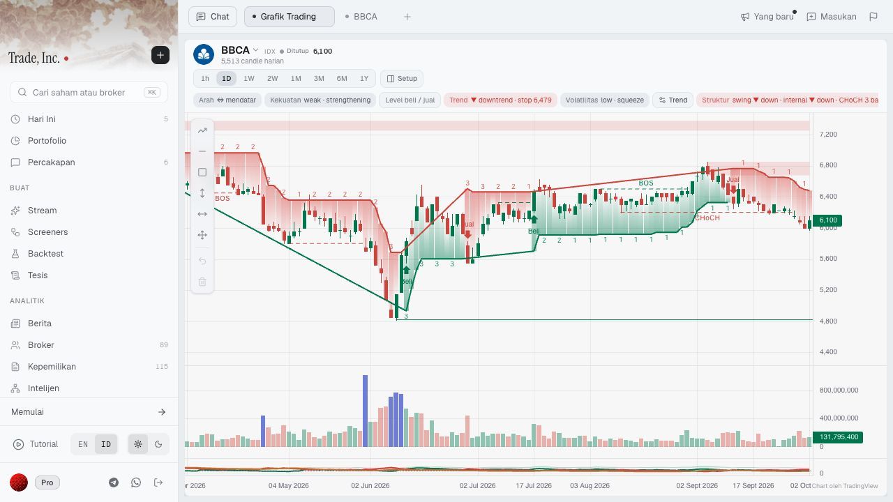
Step 2 — Select “1D” in the toolbar above the chart. Read the direction and strength summaries above the candles, then inspect the price and volume panels. “Beli” and “Jual” markers are product annotations, not recommendations from this article.
The daily view displayed 5,513 daily candles, an Arah (direction) label of mendatar (sideways), and strength described as weak · strengthening. These are observations of the interface at capture time. We did not independently validate the underlying calculations or certify that the history was complete.
Notice the language: “weak” describes a state, while “strengthening” describes change. Neither automatically means an upward price trend. A separate trend label also appeared on the screen; it should not be silently substituted for the direction field.
3. Switch to weekly and inspect the result
Click 1W, next to 1D in the upper toolbar. The chart should visibly change; do not rely only on remembering which button you pressed.
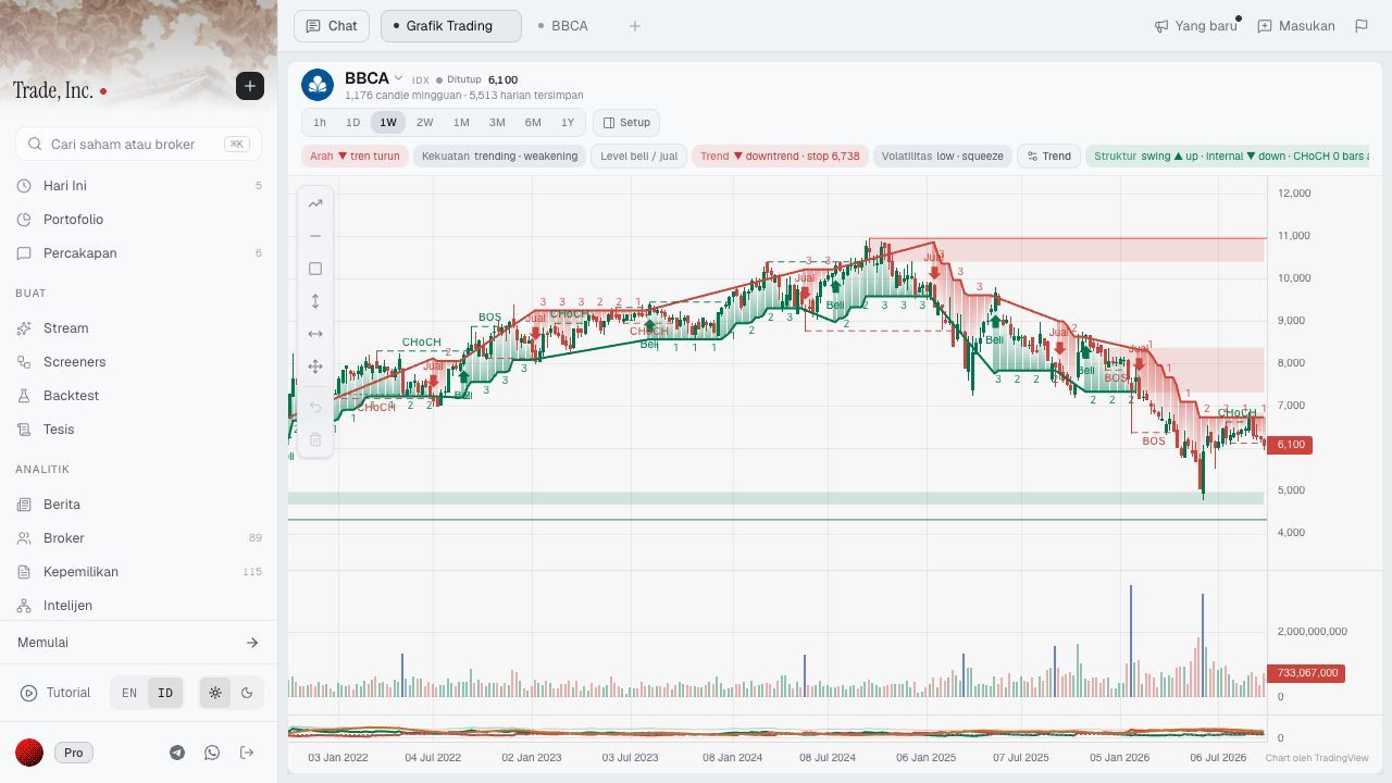
Step 3 — After clicking “1W,” verify the selected interval and the weekly history label. In this capture, the direction summary changed to “tren turun” and strength to “trending · weakening.” The wider visible history is also apparent on the horizontal axis.
The weekly view displayed 1,176 weekly candles and 5,513 daily stored. Its direction label was tren turun (downtrend). The comparison below keeps like fields together.
| Field observed | Daily view, 1D | Weekly view, 1W |
|---|---|---|
| Displayed history count | 5,513 daily candles | 1,176 weekly candles; 5,513 daily stored |
| Direction, Arah | Sideways | Downtrend |
| Strength summary | Weak · strengthening | Trending · weakening |
| What the demonstration establishes | A daily view and its displayed summaries | A different aggregation and different displayed summaries |
This is not evidence that one interval is more accurate. Nor do the two screenshots constitute two independent confirmations of a trade.
Why timeframe changes can change the reading
A candle summarizes open, high, low and close over its interval. The most recent candle may still be incomplete. These basic distinctions are explained in TradingView’s interval documentation; that source does not validate Trade Inc’s proprietary summaries.
For this workflow, separate two questions. Range asks how much history is visible. Interval asks what period each candle represents. Zooming out and changing candle aggregation are therefore not the same analytical operation.
Our editorial interpretation is deliberately narrow: a sideways daily direction label and a downward weekly direction label can describe different horizons. Treating them as contradictory forecasts would overstate what the interface says. Establish the horizon of your thesis first, then use the other view to challenge it.
For example, a research note might say: “The daily display is sideways, but the weekly direction remains down. I need to inspect the dates and underlying bars before calling this a reversal.” That is a question for further research, not a buy instruction.
A comparison checklist worth keeping
For each saved chart observation, record the ticker, interval, capture time and exact field name. Note whether you are describing a completed candle or a developing one. If you change settings, retain that context with the image.
Do not count direction, strength and buy/sell markers as separate votes without understanding their relationship. This walkthrough does not establish that those outputs are statistically independent. It also does not show what happens after a signal, transaction costs or drawdowns.
Limitations we found—and who this suits
The stock summary displayed a headline price of 6,150, while the full chart header displayed 6,100 during capture. We did not reconcile that difference. Do not use these screenshots as an authoritative close, a synchronized quote comparison or an execution reference; check the relevant timestamp and data source before price-sensitive use.
We tested the daily/weekly switch for one stock in a demo account. We did not audit corporate-action adjustments, feed latency, the full history, every interval or the formulas behind the labels. No backtest, Screener or order was created.
This workflow suits someone already using Trade Inc who wants to inspect multiple chart horizons without leaving the research workspace. If your only requirement is an occasional daily-versus-weekly view and your existing chart already supplies it, this demonstration alone is not a reason to buy another subscription.
Conclusion
Use the chart switch to make your research question more precise: open the stock, establish the daily view, switch to weekly, then compare the same fields with their timestamps and limitations attached. The benefit demonstrated here is a repeatable inspection workflow—not proof of a profitable signal.
For related research, see what AI candlestick analysis can and cannot establish, double-bottom confirmation, and inspecting intraday Streams evidence.
This article is for research and information only. It is not personalized financial advice or an instruction to trade.